Nano Banana 2.1 Review: We Tested It on Real Ad Briefs
We ran Nano Banana 2.1 on the briefs ads actually need: real faces, product shots, posters and same-character edits. Here are the results, the exact prompts, and what worked.
Every image model looks great in its own launch reel. The real question is what happens when you hand it a boring, specific brief: a product shot with room for copy, a poster with exact words on it, a face that has to look like a person and not a render. So the day after Google shipped Nano Banana 2.1, we stopped reading threads and started running prompts. This Nano Banana 2.1 review is what came back, plus the prompting habits that got us there.
Short version: it's very good at the jobs ads actually need. Realistic people, clean product photography, correct on-image text. Every inline image in this post came straight out of Nano Banana 2.1 on each::labs, untouched, so you can judge for yourself.
What Nano Banana 2.1 Actually Is
Nano Banana 2.1 is Google's update to Nano Banana 2 (Gemini 3.1 Flash Image). According to Google's model page, it keeps Flash-level speed while improving visual quality, prompt adherence, multi-turn character consistency and text rendering. It outputs at 1K, 2K or 4K (1K is the default), and Google says it fixed the tiling artifacts that used to show up on very wide and very tall frames like 4:1 and 1:8 at 2K and 4K.
Two other details matter for real work. It accepts up to 14 reference images in one request (Google's guidance is up to 4 characters or 10 objects), and it has configurable thinking, so the model can reason about a complex prompt before it draws. In Google's own announcement, the headline gains were visual design, mask-based editing and subject consistency. Google's API docs also list it as the recommended replacement for Nano Banana 2, so if you build on the family, this is the version to learn.
On each::labs it's live in two flavours: Nano Banana 2.1 Text to Image and Nano Banana 2.1 Edit, both in the Nano Banana 2 family. For our tests we used 16:9 at 2K and left temperature, thinking and seed at their defaults. No cherry-picking across dozens of seeds: what you see is the first result for each prompt, plus one rewritten prompt we'll tell you about.
Test 1: Can Nano Banana 2.1 Do a Real Human Face?
Faces are where image models get caught. Skin turns to plastic, eyes go glassy, laughter looks like a dental ad. So we started there, with an older face, because wrinkles and freckles are harder to fake than a smooth 25-year-old.
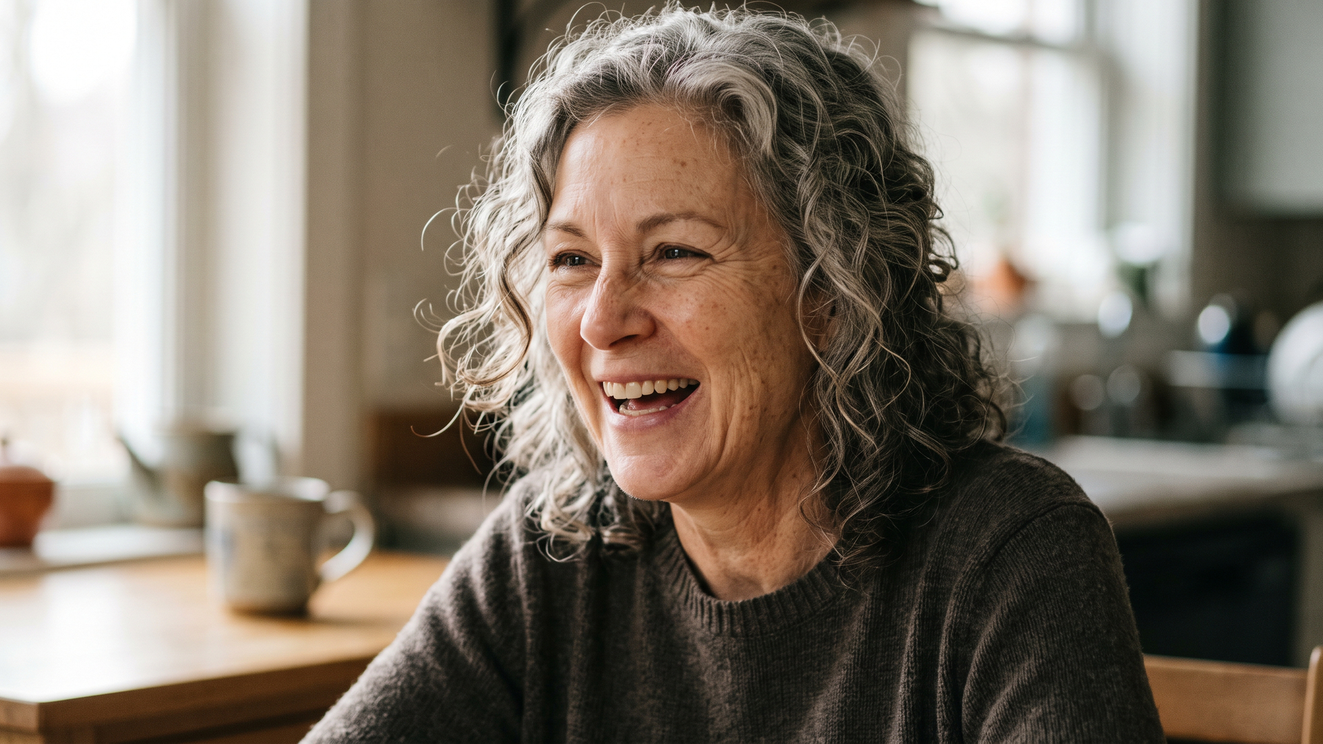
A photorealistic close-up portrait of a woman in her late fifties with silver-streaked curly hair, laughing mid-sentence at a kitchen table in morning light. Soft window light from the left, visible skin texture, fine laugh lines, a few freckles. Shot from eye level on an 85mm lens at f/2, shallow depth of field, warm natural colour grade.
The result is the strongest image of the whole session. The laugh lines sit where real laugh lines sit. Freckles are irregular, not stamped. The curls catch the window light individually, and the background falls off the way an 85mm at f/2 would actually render it. Nothing about it reads as "AI portrait". It reads as a photo somebody's daughter took.
That's the headline of this review. If your work involves people (testimonial visuals, lifestyle campaigns, brand storytelling), Nano Banana 2.1's realism is the reason to try it first. Notice that the prompt doesn't say "ultra realistic, 8K, masterpiece". It names a lens, an aperture, a light source and the texture details we cared about. Specific photography language does more than any stack of quality keywords.
Test 2: A Product Shot That Leaves Room for Copy
Ad teams don't need pretty pictures. They need pretty pictures with negative space exactly where the headline goes. We wrote our first product prompt using the template Google publishes in its image generation guide (product, surface, lighting setup, purpose, angle) and named a softbox as the light source.
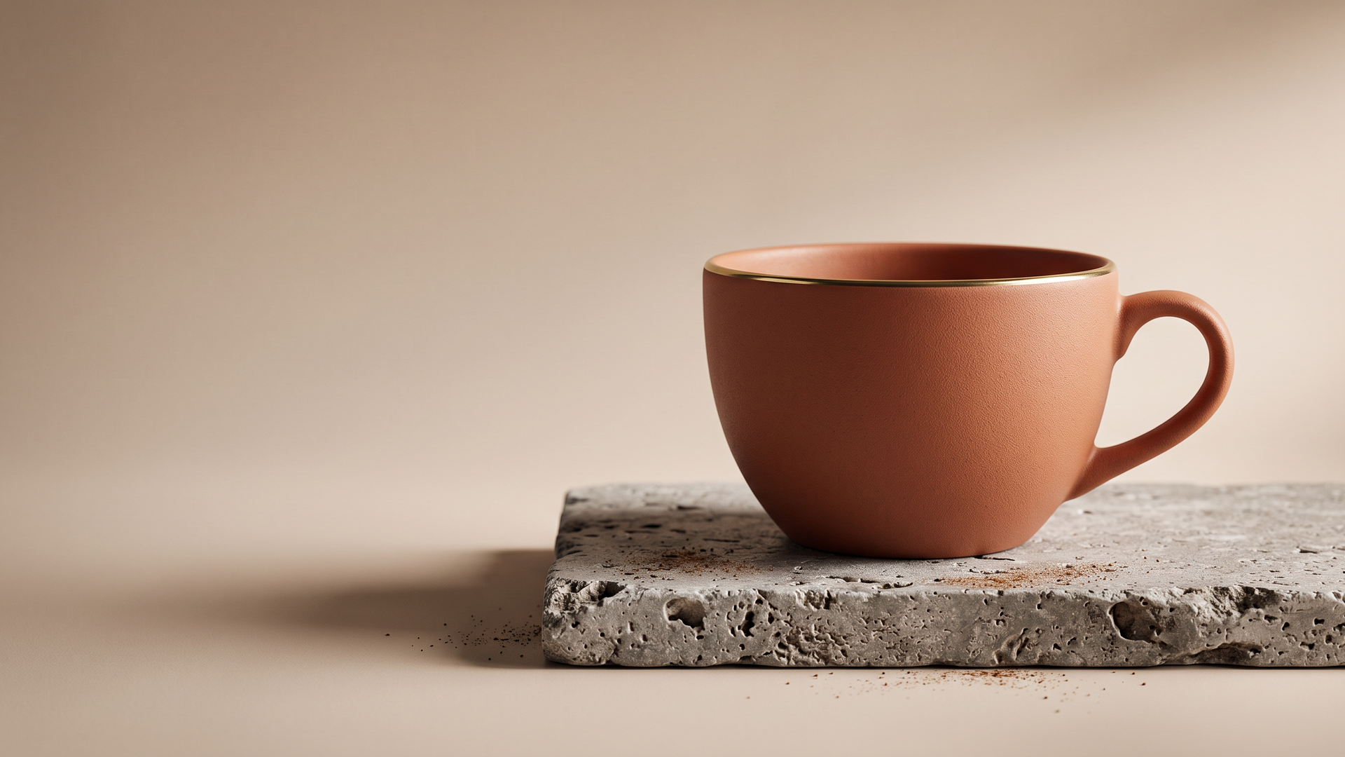
Here's the thing we learned: Nano Banana 2.1 takes you literally. It lit the cup beautifully, nailed the gold rim and the travertine, left the left side empty for copy, and also placed the softbox itself in the corner of the frame. Strong prompt adherence, in other words. So we rewrote the light as an effect instead of a piece of equipment:
A high-resolution, studio-lit product photograph of a matte terracotta ceramic coffee cup with a thin gold rim, sitting on a slab of rough grey travertine. Soft, diffused light falls from the upper right, with a gentle rim highlight that shows the glaze texture and a soft shadow to the left. Low three-quarter camera angle to showcase the gold rim. Seamless warm beige backdrop, premium lifestyle-ad aesthetic, generous negative space on the left for copy.
That version is campaign-ready. The matte glaze has a fine, believable grain, the rim reads as metal and not yellow paint, the stone has real pits and edges, and the model even added a scatter of coffee grounds that makes the set feel styled by a person. The left half is clean enough to drop a headline on without retouching.
Test 3: UGC and Lifestyle Ads
Polished studio work is one skill. Looking unpolished on purpose is another, and it's the one social ads run on. We asked for a candid smartphone-style shot of a young man holding a cold brew bottle toward the camera on a busy sidewalk at golden hour, with "realistic hands with five fingers gripping the bottle" and a blank kraft label.
It delivered exactly that: a natural grip, believable foreshortening on the outstretched arm, soft background blur with pedestrians who look like pedestrians, and a sun flare that feels accidental. The label stayed blank, which is what you want when your real packaging gets composited in later. A second prompt, two friends at a hillside picnic pouring sparkling water, came back with true-to-life skin tones, crisp glassware and a checked blanket with clean pattern geometry. Both would pass as stock photography from a good shoot.
Our take after these three tests: Nano Banana 2.1 works best where realism is the brief. Faces, hands, materials, light. That's most of advertising.
Test 4: Text on the Image, Spelled Right
Google calls out text rendering as one of the main upgrades, so we gave it a classic small-business job: a bakery poster with a brand name, a headline and a tagline, each in a defined style.
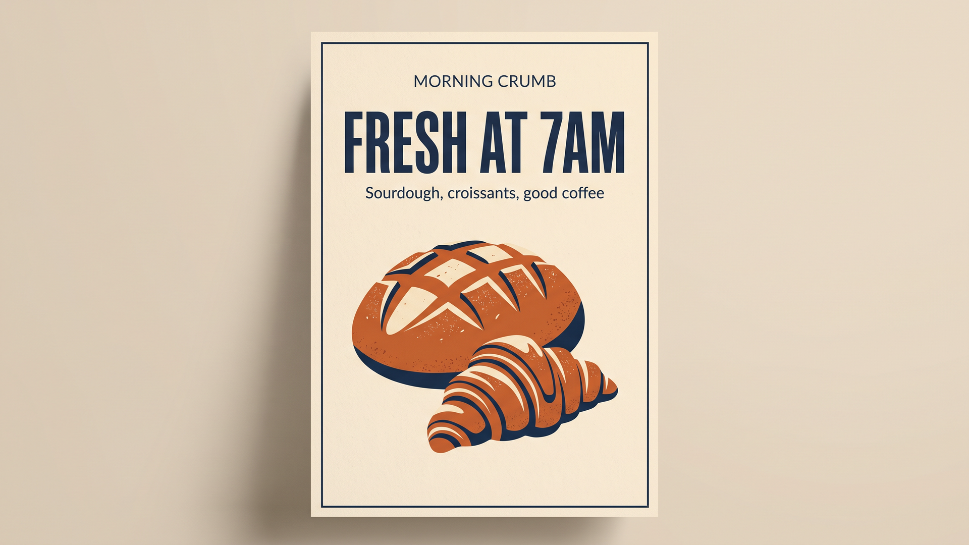
Create a minimalist poster for a neighbourhood bakery called Morning Crumb with the headline 'FRESH AT 7AM' in a bold condensed sans-serif and the smaller line 'Sourdough, croissants, good coffee' beneath it. The design should be a flat illustration of a croissant and a loaf on a cream background, with a palette of burnt orange, cream and deep navy.
Every word came back correct, with the hierarchy we asked for: small brand name, big condensed headline, lighter tagline, then the illustration. The palette held to the three colours. The model also chose to present the poster as a mockup on a wall, which is a nice touch for a pitch deck. If you want a flat, print-ready file instead, say "full-bleed flat artwork, no mockup".
The pattern that works is the one in Google's guide: put the exact text in quotes, name the font style, then describe the design and colours. Quoting the words is the single biggest lever for accurate text.
Test 5: Infographics and Step-by-Step Layouts
We pushed text harder with a four-step pour-over coffee infographic: line icons, a teal accent, and four exact labels. All four labels rendered correctly, in order, with consistent icons and arrows between the steps. The model also added a title and a short helper line under each step on its own initiative, which made the layout feel finished. If you want only your words, add "no additional text beyond these labels", and proof any extra copy before it ships, the way you'd proof any designer's first draft.
For explainers, social carousels and onboarding visuals, this is a real time saver. You can go from a list of steps to a usable layout in one prompt.
Test 6: Same Person, New Scene
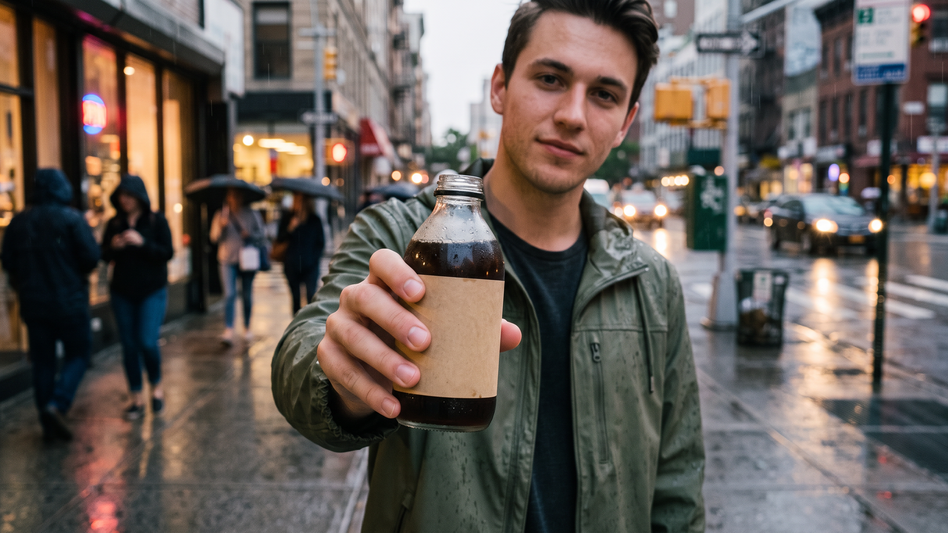
Subject consistency is the other big promise, so we took the UGC image from Test 3 into Nano Banana 2.1 Edit and asked for a different outfit and a different time of day while keeping the person.
Using the provided image, keep the same man with exactly the same face, hairstyle and expression. Change his denim jacket to an olive green rain jacket and change the scene to the same street on a rainy evening with wet pavement reflecting shop lights. He still holds the same bottle with the blank kraft label toward the camera.
Same face, same hair, same half smile. The jacket changed, rain beaded on the fabric and the bottle, the pavement turned reflective, pedestrians picked up umbrellas, and the street layout stayed recognisably the same block. This is what makes a campaign possible: one character, many situations, no reshoot. The prompt follows Google's own editing template ("Using the provided image, change only... keep everything else"), and spelling out what stays is as important as spelling out what changes.
Nano Banana 2.1 Prompting Guide: What Actually Worked
Google's image generation guide boils down to one idea: the more specific you are, the more control you have. Our tests agree, with a few refinements.
Describe the scene like a photographer, not a tagger
Write a sentence, not a keyword pile. Google's photorealistic template is a good skeleton: a photorealistic [shot type] of [subject] in [setting], [light], shot from [angle] with [lens]. Fill every slot with something concrete.
Describe what the light does
"Soft, diffused light from the upper right with a gentle rim highlight" gives you the look. "A softbox" may give you the softbox. The model is literal, so describe effects when you don't want the equipment in the frame.
Quote every word you want rendered
Put text in quotes, name the font style and say where it goes. Add "no additional text" when you need a clean layout with only your copy.
Ask for the empty space
"Generous negative space on the left for copy" was respected every time. Treat composition as part of the brief, not an afterthought for the retoucher.
In edits, say what stays
Start with "Using the provided image", list what must remain identical (face, hairstyle, expression, product), then the change. For multi-image work, remember the documented ceiling: up to 14 references, with up to 4 characters or 10 objects.
Use thinking for dense prompts
On each::labs you can set thinking to high when a prompt stacks many constraints (several text elements, specific layout, multiple subjects). For simple shots, the default is fast and accurate.
Where Nano Banana 2.1 Fits in Your Workflow
Our recommendation is simple. Reach for Nano Banana 2.1 when realism carries the brief: people in ads, product photography, UGC-style social creative, and anything with words on it. Pair the text-to-image model for first drafts with the edit model for variations, and you have a small content studio in two endpoints. If you want to chain it with video or upscaling, build the steps once in each::labs flows and rerun them per product.
Curious how this family evolved? Our earlier Nano Banana 2.1 launch overview covers the wider frames and sharper text, Nano Banana 2 vs Nano Banana Pro explains where the Pro model sits, and our Nano Banana 2 editing integration shows the API side. You can also browse every text-to-image model and all models on each::labs.
Frequently Asked Questions
Is Nano Banana 2.1 good for realistic people?
That was its strongest result in our tests. Skin texture, laugh lines, freckles and hands all held up, especially when the prompt named a lens, an aperture and a light source instead of generic quality words.
What's the best way to prompt Nano Banana 2.1 for text?
Quotes. Put the exact words in quotation marks, name the font style and placement, then describe the design. In our poster and infographic tests every quoted word rendered correctly.
How is Nano Banana 2.1 different from Nano Banana 2?
Google positions it as a direct upgrade: better visual quality across 1K, 2K and 4K, better prompt adherence, stronger character consistency, sharper text, and fixed tiling on extreme wide and tall ratios, at the same Flash-level speed. Google's API docs also list it as the recommended replacement for Nano Banana 2.
Can I keep the same character across several Nano Banana 2.1 images?
Yes, and the edit model makes it easy. Feed it your image, state exactly what must stay the same, then describe the change. You can also pass up to 14 reference images, with up to 4 characters, in one request.
Where can I run Nano Banana 2.1?
Right now on each::labs, as text to image and edit, through one API alongside the rest of the catalog.