Ideogram 4.5 Prompts: 12 Copy-Ready Prompts for Posters
Twelve Ideogram 4.5 prompts you can paste today, grouped by job: posters, book covers, packaging, social graphics, editorial art and text edits. Plus the prompt building blocks, the settings that matter and notes from our own test runs.
By Eftal Yurtseven · Nov 17, 2026 · 9 min read
Spelling a word right isn't the hard part any more. Getting the word in the right place, at the right size, in a typeface that suits the job, with the date line still legible at the bottom of the flyer: that's where most image models quietly give up. Good Ideogram 4.5 prompts treat type as layout, not decoration, and the model rewards you for it. Below: 12 copy-ready prompts grouped by job, the building blocks behind them, and what we saw when we ran six of them ourselves.
Ideogram 4.5 is live on each::labs as a text-to-image model and as Ideogram 4.5 Edit. Ideogram pitches the release as "the most precise edit model," built so multi-turn editing doesn't pile up artifacts, and Ideogram's own model page lists native 2K resolution. We've already covered why its edits don't drift and how to paint a mask. This one is for people who want something to paste.
The Building Blocks of an Ideogram Prompt
Every prompt here is built from the same five parts. Learn them and you'll write your own.
The exact text, in double quotes. Anything the viewer should read goes inside quotes, spelled and capitalized exactly as you want it printed. Quotes are the cleanest signal that these characters are copy, not description.
Position and hierarchy. Say where each piece of text sits and how big it is relative to the rest: "huge headline across the top," "small three-line block, bottom left." The model reads this like a layout brief. Skip it and it guesses, usually centered and usually too big.
Typography words. Describe the letterforms the way a designer would: condensed sans-serif, high-contrast serif, italic script, spaced capitals. Skip trademarked font names. Category plus weight plus spacing gets you close.
Style and medium. Swiss modernist poster, loose gouache, flat vector, studio product photography. One clear medium beats three competing ones.
The quiet constraints. "No other text," "generous margins," "lots of empty sky." They stop the model from filling every gap with extra words or props. They feel optional. They aren't.
Settings That Matter on each::labs
The text-to-image model keeps its controls short. image_size takes square_hd (the default), square, portrait_4_3, portrait_16_9, landscape_4_3 or landscape_16_9. quality is low, medium (default) or high. num_images goes from 1 to 8, and an optional seed makes a run repeatable. The prompt takes up to 10,000 characters.
Pick the size from where the image will live: portrait_16_9 for posters and stories, portrait_4_3 for covers, square_hd for feed posts and label shots. In our runs those presets came back at 720 by 1280, 864 by 1152 and 1024 by 1024 pixels respectively, which is worth knowing before you plan a print layout around them.
Explore copy and layout on low with a fixed seed, then rerun the winner on high. Our low-quality social graphic was already clean enough to judge the layout.
The edit model adds a very_low tier, an image_size of auto that keeps the source geometry, up to four reference_image_urls, and an optional mask_url where black marks the area to edit and white the area to keep. A masked request takes up to three references and always keeps the source size.
Ideogram 4.5 Prompts for Posters and Event Flyers
Posters are the purest test of a type model: a big headline, a small information block, and an image that has to share the space. We ran the first prompt below on high quality in portrait_16_9.
A vertical jazz festival poster in a bold Swiss modernist style. At the top, the headline "NIGHT TIDE" in huge condensed sans-serif capitals, tightly kerned, cream on deep navy. Below it, a single abstract saxophone made of overlapping orange and teal circles. At the bottom, a small three-line text block left aligned: "Harbor Stage", "June 14 to 16", "Doors 7 PM". Flat colors, generous margins, strict grid, subtle paper grain.
What came back: a clean two-line headline and all three info lines spelled and ordered exactly as written, left aligned at the bottom. The one drift was the typeface. We asked for condensed and got a heavy, wide grotesk instead. If the condensed cut matters, say it twice ("narrow, condensed, tall letters").
A landscape flyer for a Saturday farmers market, hand-printed risograph look in two inks, green and pink. Left half: a stacked headline "FRESH ON SATURDAY" in bold blocky letterpress capitals, slightly misregistered. Right half: an illustration of a crate of tomatoes, leeks and radishes. Along the bottom edge, one line of small text: "Town Square, 8 AM to 1 PM". Visible ink texture, off-white paper, no other text.
Book Cover Prompts That Respect the Title
Covers are a hierarchy problem: the title wins, the author name stays quiet, and the art leaves them room. Tell the model where the empty space goes.
A literary fiction book cover. A lone lighthouse painted in loose gouache on a stormy grey-green sea, seen from far away, lots of empty sky. The title "The Salt Year" set large in an elegant high-contrast serif, centered in the upper third. The author name "Mira Okafor" in small spaced capitals at the bottom. Muted palette, matte texture, quiet and melancholic.
We ran this one on medium in portrait_4_3. Both lines of text came back spelled right, the author name in genuinely spaced capitals, and the lighthouse sat small under a wide painted sky. The title was more restrained than "large" suggests, so if you want a shouting cover, ask for the title to span the full width.
A middle-grade adventure book cover, bright and energetic. A girl in a yellow raincoat riding a giant paper boat down a flooded city street, seen from a low angle, splashes everywhere. The title "The Paper Fleet" in big hand-lettered rounded capitals with a white outline, arched across the top. Below the title, "Book One" in a small ribbon banner. Saturated colors, painterly digital illustration, cinematic light.
Packaging Label Prompts That Read Like Print
Labels mix three sizes of type on a curved surface inside a photo. Give each line its own style and position.
Product photo of a small glass jar of wildflower honey on a pale oak table, soft window light from the left. The jar has a kraft paper label with a hand-drawn bee illustration and the text "WILDFLOWER HONEY" in rounded vintage serif capitals, with "Raw and Unfiltered" below in small italic script, and "340 g" at the bottom. Shallow depth of field, warm natural tones, studio product photography.
This was our favorite result. All three lines rendered correctly, including the cursive script, and the label sat on the curve of the jar like real print. It also added a lavender sprig we never asked for, so on a strict packshot add "no props on the table."
A matte black coffee bag standing on a concrete counter, top-down soft light. A cream label on the front with "SLOW MORNING" in a bold condensed sans-serif, "Medium Roast" underneath in thin small capitals, and a simple line drawing of a sun rising over hills. A small line at the bottom of the label reads "Whole Bean 250 g". Minimal, premium, clean product photography, no other text.
Social Graphics That Read on a Phone
On a feed, the headline has to land at thumbnail size: fewer words, heavier weights, high contrast.
A square social media graphic announcing a workshop. Bright tomato red background, a big white headline "Learn to Bake Sourdough" in a chunky rounded sans-serif across the top half, set on three lines. Below, a playful flat illustration of a round loaf with steam swirls. A small pill-shaped white badge in the bottom right corner with the text "Sat 10 AM" in red. Clean vector style, high contrast, no other text.
We ran this on low quality. Spelling was perfect, the badge landed in the corner with red text as asked, and "no other text" held: nothing extra crept in. The headline came back on two lines instead of three. When the line breaks matter, write each line as its own quoted string, the way the poster prompt does.
A square quote card on a soft sage green background with fine paper texture. In the center, the quote "Make the second draft braver than the first." in a warm editorial serif, five lines, generous line spacing. Under it, a short thin rule and "Weekly Writing Notes" in small spaced capitals. Lots of empty space around the text, minimal and calm, no illustrations.
Editorial Illustration With a Headline Inside
Magazine openers pair one conceptual image with a short display line. One idea each.
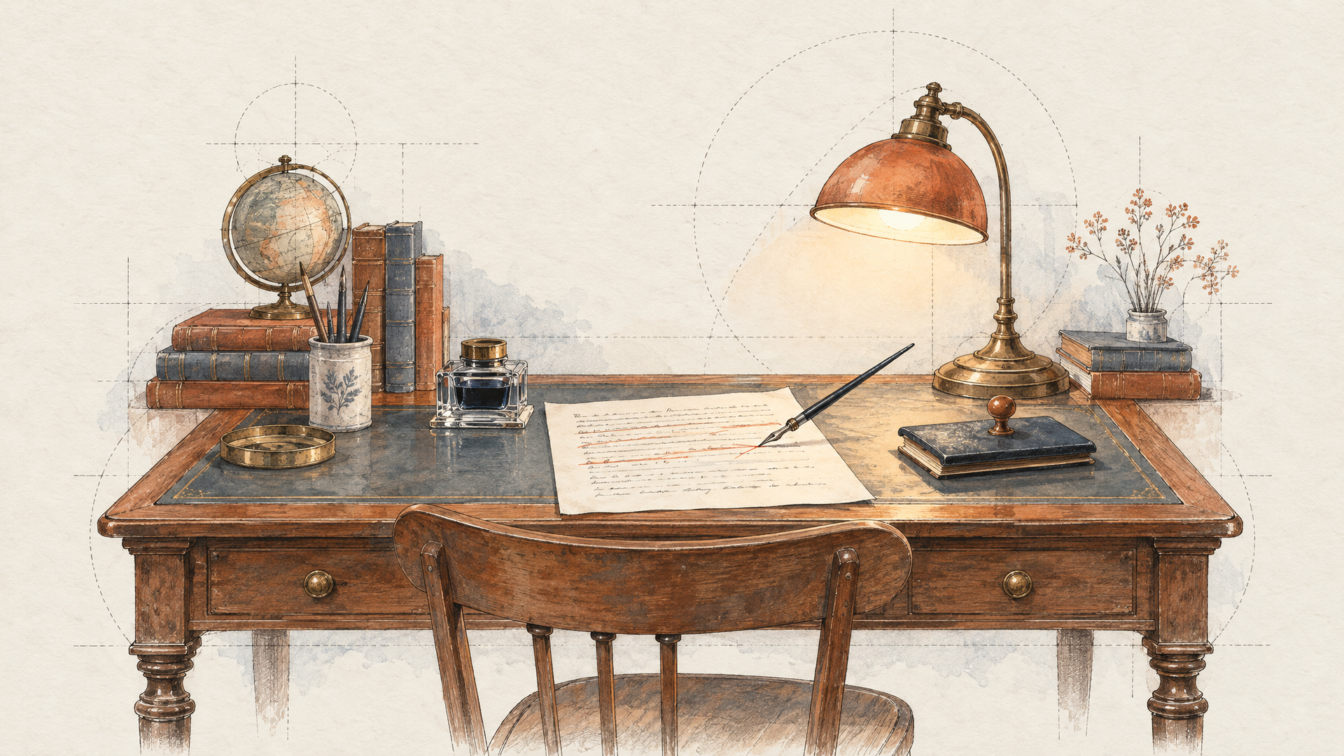
An editorial magazine illustration for an article about remote work. A tiny figure sitting at a desk on top of a giant floating laptop drifting through a pastel sky full of clouds shaped like chat bubbles. In the lower third, the headline "Everywhere, All Day" in a bold geometric sans-serif, dark blue. Grainy texture, limited palette of peach, sky blue and navy, mid-century print look, landscape composition.
Ideogram 4.5 Edit Prompts: Change the Words, Keep the Page
This is where 4.5 earns its name. Ideogram's own examples include translating text on finished designs. The pattern is always the same: name the old text, name the new text, list what stays. We ran the first two on medium, on the images generated above.
Change the date line at the bottom from "June 14 to 16" to "July 5 to 7". Keep the same font, size, color and left alignment. Do not change the headline, the saxophone illustration or the other two lines.
The new date came back in the same face, size and position, and the rest looked untouched side by side.
Translate the label text into French: "WILDFLOWER HONEY" becomes "MIEL DE FLEURS" and "Raw and Unfiltered" becomes "Brut et non filtré". Keep the same lettering styles, sizes and positions, keep the bee drawing and "340 g" as they are. Leave the jar, the table, the light and the background untouched.
Both lines switched to French in their original styles, the script line kept its handwriting feel, and the accented é rendered cleanly. Jar, lavender and light stayed put. Supply the translation yourself: you control the wording, the model handles the lettering.
The third pattern uses a reference image. Pass your poster as image_url and a lettering sample in reference_image_urls:
Restyle the headline "NIGHT TIDE" using the brush lettering style from the reference image, same cream color, same size and position. Keep the background, the illustration and the bottom text block exactly as they are.
Need a hard boundary? Add a mask, as the mask editing guide shows.
What Our Test Runs Taught Us
Six generations is a small sample, so read these as field notes. Across four text-to-image runs and two edits, every quoted string came back spelled correctly, including script lettering and a French accent. Position instructions were followed every time. What drifted was softer: a typeface category, a line count, one unrequested prop. All fixable in the prompt.
The bigger lesson is order: text first, then layout, then style. Prompts that bury the copy behind a paragraph of mood tend to get the mood right and the copy approximately right. Ideogram is a type-first model (our roundup of the best models for text and typography shows where it sits), so write type-first prompts.
Run These Prompts on each::labs
Both models use the same prediction API as everything else on each::labs. Generation looks like this:
curl -X POST https://api.eachlabs.ai/v1/prediction/ \
  -H "X-API-Key: $EACHLABS_API_KEY" \
  -H "Content-Type: application/json" \
  -d '{
    "model": "ideogram-v4-5-text-to-image",
    "version": "0.0.1",
    "input": {
      "prompt": "A square quote card ... no illustrations.",
      "image_size": "square_hd",
      "quality": "low",
      "num_images": 4,
      "seed": 31
    }
  }'
The response carries a predictionID; poll GET https://api.eachlabs.ai/v1/prediction/<id> until the status is success, or pass a webhook_url to get called back. For edits, switch the model to ideogram-v4-5-edit and add image_url. To chain generation into an edit pass, build it in each::labs AI Flows, or compare the rest of the Ideogram family with every text-to-image model and image-to-image model.
Frequently Asked Questions
How should I format text in Ideogram 4.5 prompts?
Put every readable word in double quotes, exactly as it should print, and give each line its own quoted string when line breaks matter. Then say where it sits and what the letters look like. In our runs, quoted text came back spelled correctly every time.
Which quality setting should I use for typography?
Start low with a fixed seed while you decide copy and layout (even low gave us correctly spelled type), then move to high for the final. The edit model adds very_low for the fastest checks.
Can Ideogram 4.5 Edit change text without redrawing the design?
Name the old string, the new string and everything that must stay; in our tests a date swap and a full French translation both kept the original lettering style, position and surrounding image.
Should I put brand names or logos in my prompts?
No. Use invented product names and describe letterforms by category (condensed sans, high-contrast serif) instead of trademarked typefaces. Add any real mark later in your design tool.