MAI Image 2.5: Real Light, Readable Text
You've seen it. You write a clean prompt for a product label, a poster, a packaging mockup, and the image comes back gorgeous except the headline reads "PREMUIM CFOFEE" in letters that melt halfway through the word. So you open Photoshop and fix it by hand, which defeats the entire reason you generated the image in the first place. Text has been the quiet failure of AI image generation for years. Everything else got better lighting, skin, composition while typography stayed stuck somewhere betw

You've seen it. You write a clean prompt for a product label, a poster, a packaging mockup, and the image comes back gorgeous except the headline reads "PREMUIM CFOFEE" in letters that melt halfway through the word. So you open Photoshop and fix it by hand, which defeats the entire reason you generated the image in the first place.
Text has been the quiet failure of AI image generation for years. Everything else got better lighting, skin, composition while typography stayed stuck somewhere between a ransom note and a fever dream. That's the gap MAI Image 2.5, Microsoft's image model, is built to close. And the way it closes it changes what you can actually ship from a single prompt.
The Real Problem With AI Typography
Here's the question worth asking before you pick any image model for design work: are you generating a finished asset, or are you generating a nice background that still needs a designer to bolt the words on?
For most models, the honest answer is the second one. They treat text as decorative texture shapes that look like letters from across the room and fall apart up close. That's fine for a moodboard. It's useless for a label that has to say the brand name correctly, a poster with a real date on it, or a packaging comp a client will scrutinize letter by letter.
The cost isn't just the retouching. It's the broken loop. Every round trip through a manual fix is a round trip where you can't iterate fast, can't hand the model a tweak and trust the output, can't let a non-designer on the team produce something usable. Reliable text isn't a nice-to-have feature. It's the thing that decides whether the model belongs in your pipeline or just your scratchpad.
What MAI Image 2.5 Actually Is
MAI Image 2.5 is part of Microsoft's in-house MAI family models built and trained by Microsoft rather than licensed in. The "2.5" matters: this is an iterated line, not a first swing, and the improvements show up exactly where earlier image models tended to flinch.
On Eachlabs it arrives as two distinct models, not two buttons on one. There's a text-to-image model for generating from a written prompt, and an image-to-image model for editing feeding it a picture and a set of instructions and getting a controlled revision back. They share a sensibility but solve different jobs, and knowing which one you're reaching for is half the battle. Generating a brand-new concept is text-to-image. Refining, restyling, or correcting something you already have is image-to-image.
What ties them together is a clear design intent. This isn't a model tuned to win art prizes with surreal dreamscapes. It's tuned to be dependable: photoreal output, natural light, skin that reads like skin, and text you can actually leave in the final file.

How It Works, And What It Lets You Control
The training is the boring part. The interesting part is the control it hands you.
Start with text. MAI Image 2.5 treats words as words characters it's meant to render correctly rather than as a vague pattern of marks. That means when you specify a headline, a logotype, a line of fine print, it holds the spelling and the letterforms together far more reliably than the category norm. For brand and packaging work, that single property is the difference between a comp and a placeholder.
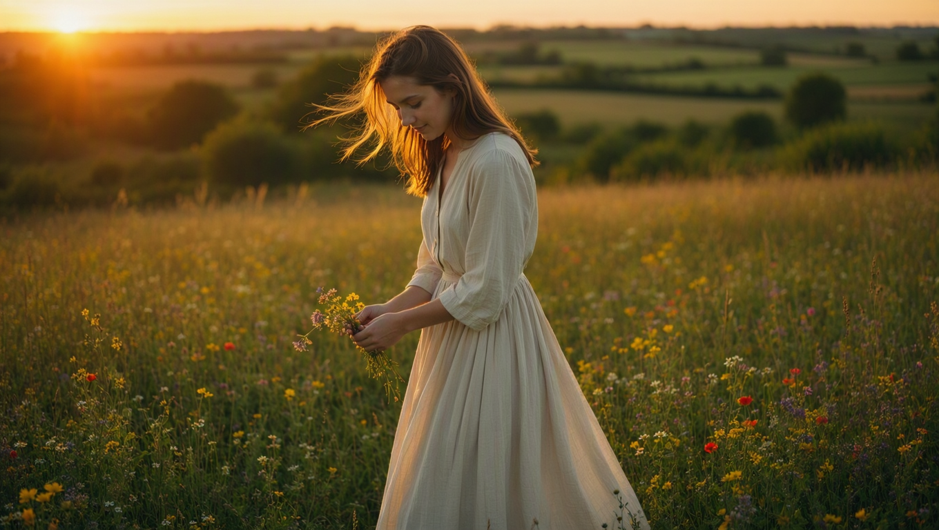
Then there's the light. The model leans photoreal, and specifically toward natural light, the soft falloff of a window, the way shadows actually sit on a face, the slight imperfection in real skin that keeps a portrait from sliding into plastic. You can push it toward a look, but its default instinct is believable rather than glossy.
The image-to-image model is where precise control gets concrete. You're not regenerating from scratch and hoping the magic repeats. You hand it an image and tell it what to change swap the background, adjust the wording on a label, restyle a scene while keeping the subject intact and it edits with intent instead of starting over. That's the difference between a slot machine and a tool.

Type That Survives a Close Look
Let's stay on text, because it's the headline reason to reach for this model.
The win isn't that MAI Image 2.5 can render a word. Plenty of models can produce one correct word if you're lucky and the font is generic. The win is dependability across the stuff that actually breaks lesser models: longer strings, brand names that aren't dictionary words, layouts where text has to sit cleanly inside a design rather than float on top of it.
For a marketer mocking up ten ad variations, that reliability compounds. For a designer building packaging, it means the label can carry the real product name on the first pass. You stop budgeting time for the inevitable typography cleanup, because the cleanup mostly isn't there.
Light, Skin, and the Photoreal Default
The second pillar is realism that doesn't tip into uncanny. MAI Image 2.5's natural-light bias is doing quiet work here. Harsh, evenly-lit, over-rendered output is the tell of an AI image; soft directional light with honest shadows is what makes a frame read as photographed.
Skin is the hardest test, and the model handles it with restraint. Pores, texture, the subtle unevenness of a real complexion the details that flat, beautified renders sand away. If you're producing lifestyle imagery, portraits for a brand page, or any shot where a human face has to be convincing, that restraint is the whole game.
Where People Actually Use MAI Image 2.5
Brand and packaging designers get the most obvious payoff. A label with correct copy, a box mockup with a readable panel, a poster with a real headline generated, not assembled collapses hours of layout into a prompt.
Marketers running volume benefit differently. When you need fifteen on-brand variations of an ad with legible text in each, a model that holds typography under repetition is the one that keeps the batch usable.
Solo designers and small teams might gain the most. The editing model means one person can generate a concept, then refine it without owning a full retouching skill set, fix a word, change a background, adjust a look and stay inside a single tool the whole way.
And anyone producing lifestyle or product photography leans on the photoreal, natural-light output: e-commerce stills, social content, hero images where the difference between "rendered" and "shot" decides whether people trust it.
MAI Image 2.5 vs. the Image Models You're Used To
The trade you're making is clear once you name it. A lot of image models optimize for spectacle — wild styles, painterly flourishes, the kind of output that goes viral as art. MAI Image 2.5 optimizes for reliability in service of design. If your job is to make something striking and strange, that's not its lane. If your job is to ship a correct, believable, finished asset, that focus is exactly the point.
Against earlier image generations, the jump is mostly in the two places that used to embarrass the category: text that holds, and realism that doesn't go plastic. You give up a little of the "anything goes" surprise. You get back something you can actually put in front of a client.
Using MAI Image 2.5 on Eachlabs
On Eachlabs you'll pick the model that matches the job. Reach for the text-to-image model when you're generating from a written brief describe the scene, the layout, the exact text you want rendered, and the look. Reach for the image-to-image model when you already have an image and want a controlled edit — a corrected word, a new background, a restyle that keeps the subject.
The mental model is simple: text-to-image creates, image-to-image revises. Most real projects use both. You generate the concept, then you walk it to final with edits instead of regenerating and praying the second roll matches the first.
Getting Better Results Out of MAI Image 2.5
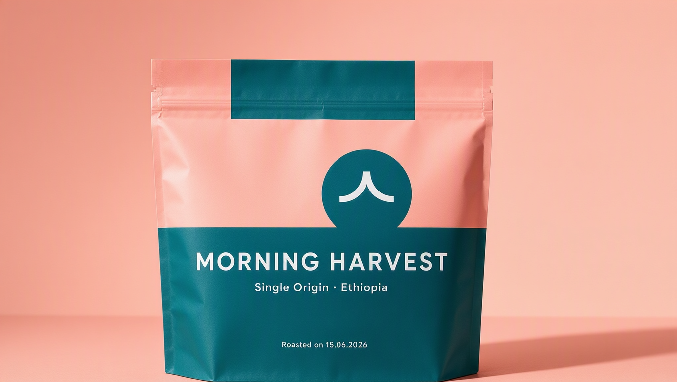
Spell out the text, literally. Put the exact words you want in quotes in your prompt, and say where they go. "The headline reads 'Morning Harvest' across the top." Vague instructions invite vague letters; explicit ones give the model something to lock onto.
Describe the light, not just the subject. Since the model's strength is natural light, use it. "Soft window light from the left, late afternoon" gets you further than "well-lit." You're steering the thing it's already good at.
Edit in passes. With the image-to-image model, change one thing at a time. A single clear instruction lands more cleanly than a paragraph of five competing edits, and you keep control over what actually changed.
Keep brand names unambiguous. If a name is unusual, give the model the spelling and a little context. The text engine is strong, but you make its job easier when you remove the guesswork.

The Honest Limitations
I don't want this to read like a brochure with the rough edges sanded off, so here's the straight version.
Text reliability is much better, not magic. Long paragraphs, dense fine print, and tiny type can still drift the model is built for headlines, labels, and brand copy, not for setting a wall of body text. Proof everything that matters before it ships.
And the photoreal, design-first focus is a deliberate narrowing. If you want wild, painterly, stylized, genuinely weird output, this isn't the tool that'll thrill you. It's tuned for believable and correct, and that tuning has a cost on the far creative end.
Wrapping Up
The reason MAI Image 2.5 is worth your attention isn't a longer feature list. It's that it fixes the one thing that kept AI images out of finished design work: text you can trust, on top of realism that holds up close. That combination turns "nice background, now add the words" into "here's the asset."
For brand, packaging, and marketing work especially, that's the line between a toy and a tool. You can try the text-to-image and image-to-image versions of MAI Image 2.5 on Eachlabs and see how much retouching quietly disappears from your process.
Frequently Asked Questions
Can MAI Image 2.5 really render text correctly?
More reliably than the category norm, especially for headlines, labels, and brand names the things that used to come out garbled. It's built around treating text as text, not decoration. Long body paragraphs are still the weak spot, so proof anything dense before you ship it.
What's the difference between the two MAI Image 2.5 models on Eachlabs?
They're two separate models, not modes of one. The text-to-image model generates from a written prompt; the image-to-image model edits an existing picture with controlled instructions. Create with the first, revise with the second most projects use both.
Who gets the most out of MAI Image 2.5?
Anyone shipping finished visual assets rather than concept art: brand and packaging designers, marketers producing on-brand variations, and small teams that need photoreal output with legible text without a full retouching pass after every generation.