What is p95? Latency Percentiles Explained
Developers throw around p95 a lot when they talk about performance. So what does it mean for someone hearing it for the first time? Let me explain with a restaurant. You run a restaurant. Today you served 100 customers, and 95 of them got their food in 5 minutes. The other 5 waited longer than that. Now somebody walks in and asks "how long does it take to get food at this restaurant?". You wouldn't average all 100 wait times together, because the slow tables would drag your answer around. Inst

Developers throw around p95 a lot when they talk about performance. So what does it mean for someone hearing it for the first time?
Let me explain with a restaurant.
You run a restaurant. Today you served 100 customers, and 95 of them got their food in 5 minutes. The other 5 waited longer than that. Now somebody walks in and asks "how long does it take to get food at this restaurant?". You wouldn't average all 100 wait times together, because the slow tables would drag your answer around. Instead, you'd look at where the bulk of your customers landed and say "about 5 minutes". That 5-minute number is your p95.
So why this number specifically? Why is the experience of 95 customers used to describe how the whole restaurant performs?
Because p95 captures what almost everyone went through, without letting a handful of outliers distort the picture. It's an honest representation of the typical experience.
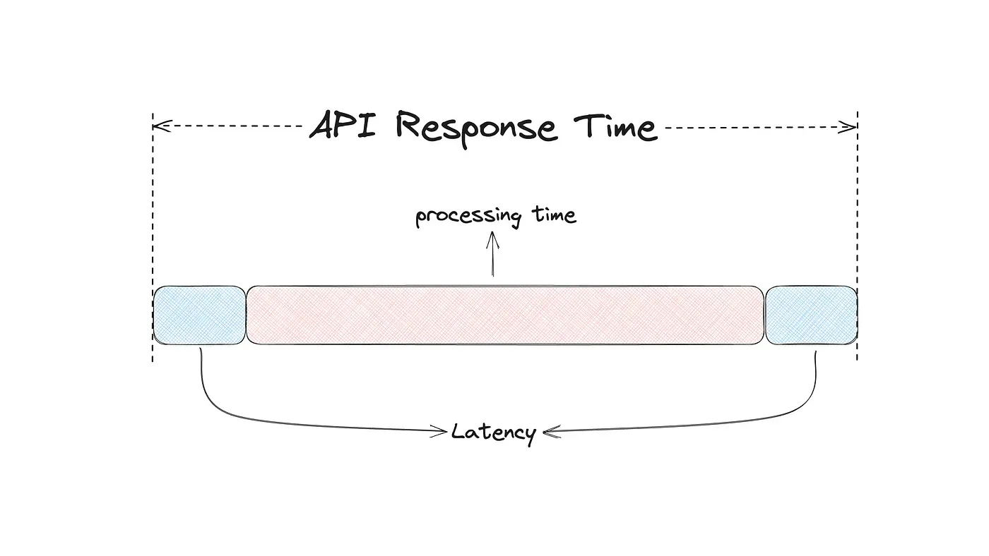
Software performance works the exact same way. Every time your app or website talks to a server, the request takes some time to come back. p95 is the response time that 95% of those requests fit inside. The slowest 5% sit beyond it. Same restaurant logic, just applied to API calls instead of meals.
How is p95 Actually Calculated?
The calculation is actually pretty easy when you walk through it.
Your API receives 100 requests. Each request returns with a response time in milliseconds. You list all 100 response times from smallest to largest. The 95th value in that list is the one you care about. Whatever number lives there is your p95.
That's the whole calculation. List them, count to 95, read what's there.
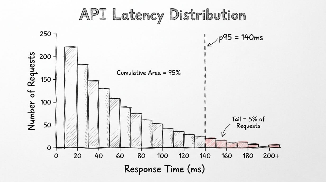
The same logic works with bigger sample sizes. Your API receives 10,000 requests per minute and the p95 comes back at 140ms. 9,500 of those requests completed in under 140ms. The remaining 500 didn't. 9,500 is just 95% of 10,000. The 500 is the slow tail that gets ignored in averages but always ends up as a support ticket.
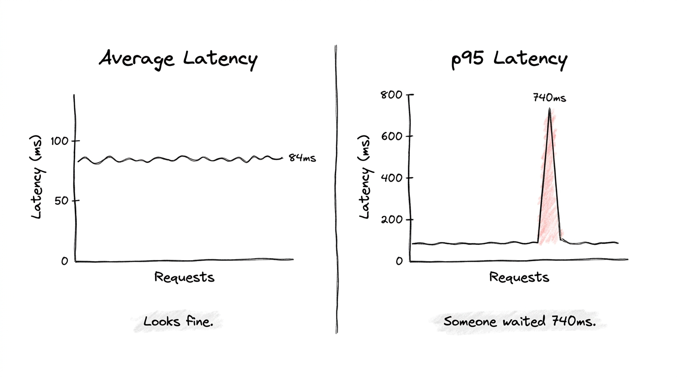
A tiny example makes the contrast obvious. Picture 10 requests with these response times in milliseconds: 11, 10, 13, 12, 10, 14, 11, 13, 12, 740. Their average is around 84ms. Nothing alarming about that number on any dashboard. But your p95 here is 740ms, because that one slow request sits at the top of the sorted list. Some user clicked something and waited nearly a full second while your average pretended everything was fine.
That's the whole reason p95 exists. Averages hide outliers by burying them in fast requests. p95 refuses to bury them.
p50, p75, p90, p95, p99: Why So Many Variations?
When you look at any real performance dashboard, you'll see all five of these numbers sitting next to each other. They're all calculated the same way: sort response times, pick a percentile, read the value. The difference between them is which slice of users you're focusing on.
p50 is the median. Half your requests are faster than this number, half are slower. It tells you what a totally average user experiences, but it ignores everyone whose experience is worse than the middle.
p75 widens the lens. Three quarters of requests fall under this value, which means a full quarter are slower. This is where you start catching early signs of slowdown before they become real incidents.
p90 ignores the slowest 10% of requests. Fine for low-stakes endpoints or internal tools where some variance is acceptable. The downside is that genuine problems can live inside that 10% without ever showing up.
p95 ignores the slowest 5%. This is where most production teams set their alerts. Strict enough to catch real degradation, forgiving enough that random traffic spikes don't fire constant false alarms. p95 is also the standard percentile for production SLOs, which we'll get into next.
p99 ignores only the slowest 1%. Sounds tiny on paper, but at 50,000 requests per minute, that 1% works out to 500 users every single minute hitting something broken. For payment flows, authentication, real-time features, p99 is the metric you can't afford to skip.
The pattern across all five is consistent. Higher percentiles cover fewer users but those users have the worst experience. Watching all of them at once gives you the full shape of your system, from your average user to your worst-case user.
What is an SLO and Why is p95 the Standard?
SLO is short for Service Level Objective. Basically, it's the performance bar your team commits to and keeps watching. It's the line between "everything is fine" and "we have a problem, go check it".
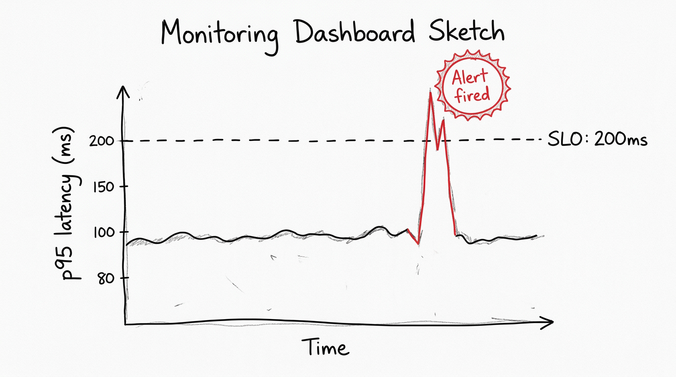
A typical SLO reads like this: p95 response time for the checkout endpoint stays below 200ms over a rolling 5-minute window. It's specific, testable, and easy to monitor. When p95 goes above 200ms, an automated alert kicks in, someone takes a look, and the team already knows the issue: more than 5% of checkout requests went over the threshold.
Setting an SLO comes down to two questions.
1) What do your users actually tolerate?
2) What is your system currently capable of delivering?
You measure your existing p95 first, then pick a target that improves on where you are but stays realistic for your setup. Your current p95 is 800ms, and you target 50ms? That isn't a plan, that's wishful thinking. Alerts would fire constantly, the team would tune them out, and the whole SLO becomes noise. Set it at 400ms instead, hit that, then tighten to 200ms over time.
So why is p95 specifically the standard for these SLOs? Because it sits at a useful middle point between two failure modes.
If you set your SLO at something like p70, you'd be officially accepting that 30% of users have a slow experience. Three out of every ten people walking away frustrated. Most teams aren't actually okay with that once they see it written down. Going the other direction with p99 as your primary SLO creates the opposite problem. p99 is so sensitive that normal traffic variance constantly trips the threshold, and your alerts start firing on random spikes. Within a week your team learns to ignore the alarm.
p95 lands in the right zone. Strict enough to catch real problems, stable enough that random noise doesn't drown out the signal. And there's another reason it became the industry standard. p95 lines up naturally with how humans actually perceive delay. Responses under 200ms feel instant. Around 1 second, people notice. Past 3 seconds, a significant share of users leave. Setting a p95 SLO around those numbers ties your engineering target directly to real human behavior.
How Do You Actually Reduce Response Times?
Knowing your p95 is one thing. Reducing it is a totally different challenge, and one fix doesn't cover everything. The right move depends on where the bottleneck is hiding.
On the code side, caching often gives you the biggest jump. When the same data keeps getting requested, you store it in memory after the first call, and the following requests skip the database completely. The first request pays the cost. Every request after that is nearly free. Query optimization is the other major lever. A single badly-written database query can add hundreds of milliseconds on its own, and profiling tools are how you find these before they become outages.
At the infrastructure layer, the gains can be even bigger but less obvious. The biggest factor here is physical distance. Every request travels through real cables and real routers. A user in Istanbul pinging a server in Virginia is fighting the speed of light, not your code. Moving your compute closer to your users is one of the most underrated p95 improvements available, and most teams don't think about it until they have to.
Running tasks in parallel instead of one after another is another big improvement. You have three database calls at 40ms each. Run them in order, total is 120ms. Run them at the same time, total drops to 40ms because the slowest step becomes your response time, not the total. Easy win if the operations don't rely on each other.
AI applications have a specific tradeoff worth calling out. Bigger, more accurate models take longer to respond. Smaller, faster models keep your p95 inside acceptable bounds but might sacrifice some output quality. Every AI product team has to make this call deliberately, and knowing your p95 is what turns that decision from a guess into actual analysis.
What Global Companies Do With Their Servers
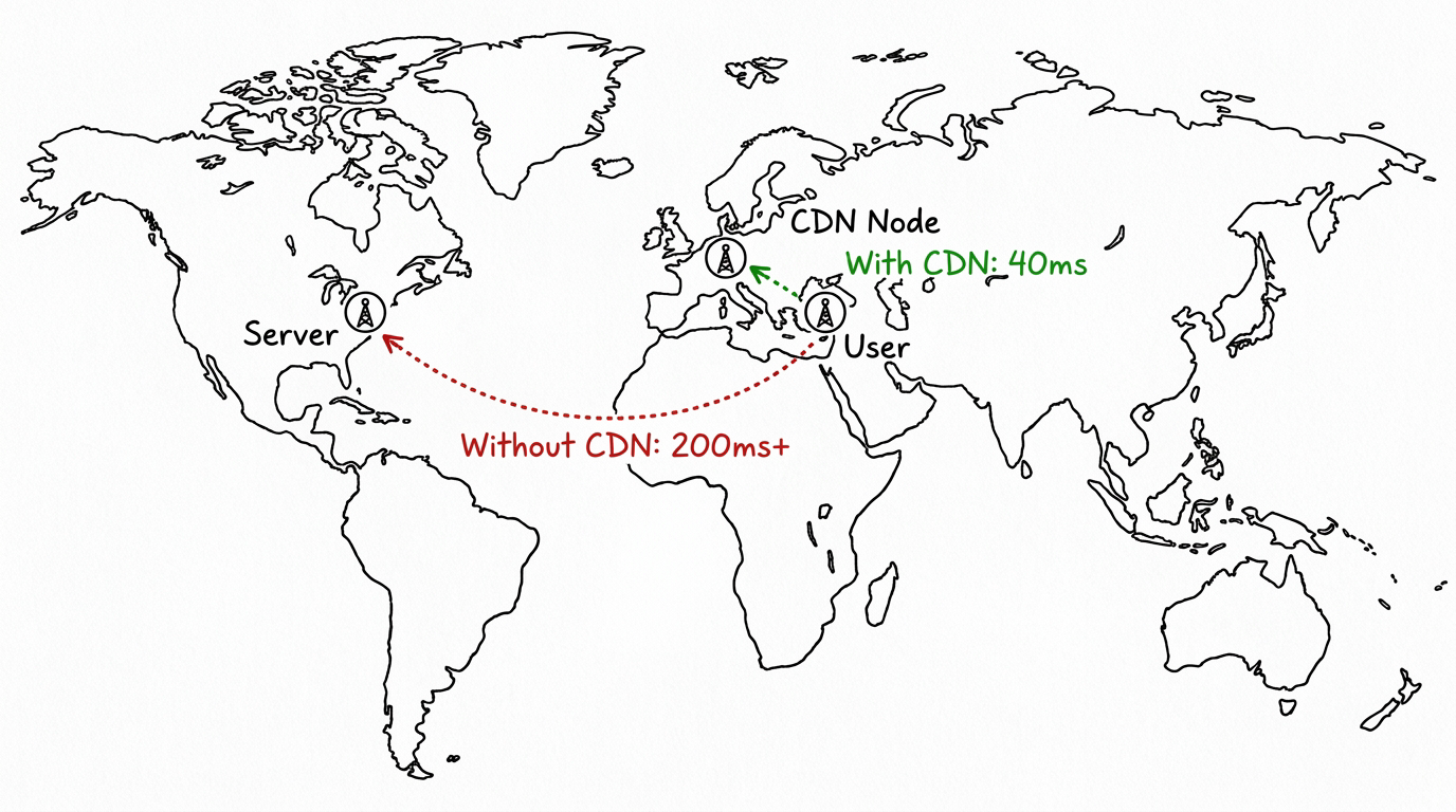
Large tech companies do not run their systems from one location. They couldn't even if they wanted to, the architecture wouldn't allow it. A California server serving an Istanbul user hits a physical limit before anything else, no matter how clean your code is.
What the big platforms do is set up hundreds of servers across every important region, with a routing layer in front that sends each request to the closest server. This entire architecture is known as a CDN, or Content Delivery Network.
Open Netflix in Istanbul tonight and your request probably hits a server in Frankfurt or Amsterdam, not Los Angeles. That alone cuts hundreds of milliseconds off your response time before any of the actual app logic runs. Google does this. Amazon does this. Cloudflare basically built a business around this. The pattern is to position content as close to the user as physically possible, ideally before the user even asks for it.
For dynamic content like API responses or AI inference, companies push this further with edge computing. The actual processing logic runs on distributed servers around the world, not just static assets sitting in regional caches. Your request still has to travel somewhere, but that somewhere is now a few hundred kilometers away instead of several thousand. This is one of the most reliable strategies global companies use to keep p95 low across different markets and geographies.
How to Use p95 on Eachlabs
If you're building AI workflows on Eachlabs, p95 matters more than it might seem at first. When you chain multiple model calls together, which is most non-trivial workflows, the latency of each step compounds on top of the others. A p95 spike in your first model isn't an isolated problem, it cascades into everything downstream.
Watching end-to-end latency at the 95th percentile is what surfaces where the actual bottleneck lives. Sometimes the generation step is fast but post-processing is dragging the pipeline. Sometimes both steps look fine individually, but their combined p95 sits above your acceptable threshold. The metric does its job either way, it shows you what users would feel before they actually have to feel it.
Wrapping Up
If your monitoring only shows average latency right now, you're missing what your users are actually going through. p95 closes that gap. It shows you the slow tail averages cover up, it matches what users actually tolerate, and that's why most production SLOs are built around it. Pick a threshold around what your users tolerate, measure your current state, aim for something realistic, then tighten as your system gets better. That's how p95 earns its place in any real monitoring setup.
Frequently Asked Questions
What's the difference between p95 and average latency?
The averaging method takes all your response times, sums them up, divides by the count, which means one painfully slow request gets diluted across hundreds of fast ones until it effectively vanishes from your dashboard. p95 skips averaging entirely. The response times get sorted, the value at the 95th position gets reported, and that's the number you see. Outliers have nowhere to hide in that calculation. Production teams rely on p95 precisely for that reason, not because averaging is broken but because it smooths over the exact signals you need to act on.
How do I know what p95 threshold to set for my SLO?
Two pieces go into setting that threshold. First, measure where your p95 currently sits under realistic production traffic. The second piece is anchoring the target to user tolerance data, which is consistent across studies. 200ms feels instant, around 1 second starts feeling slow, past 3 seconds users leave. Your target should sit between ambitious and realistic for your current infrastructure. Tighten it slowly as your system improves. One trap worth flagging is setting a number you can't actually hit, because SLOs that constantly fail train your team to tune alerts out entirely, which makes the whole exercise worthless.
When should I track p99 instead of p95?
You reach for p99 when slow responses cost you something real: revenue, user trust, regulatory issues. Payment processing, authentication, real-time features, anywhere the slowest 1% of users still hits a broken experience. At high traffic, that 1% is thousands of people per minute having a bad time. General-purpose APIs and internal tools usually do fine with just p95. High-stakes endpoints need both p95 and p99 tracked side by side, because they show different parts of the same picture.